Chapter 2 Descriptive Statistics and Programming Fundamentals in R
By the end of this chapter, you will be able to:
- Compute and interpret measures of central tendency (mean, median, mode, trimmed mean) and dispersion (variance, SD, IQR, range)
- Produce and interpret histograms, boxplots, and density plots using base R and
ggplot2 - Write reusable R functions with default arguments and proper documentation
- Use
forloops,whileloops, andapply-family functions to automate repetitive analysis - Create publication-quality summary tables using
psychandgtsummary
Why this chapter? You have collected data from 200 participants in a health study — ages, pain scores, and treatment groups. Before fitting any model, you need to understand what you actually have. Are there outliers? Are the distributions skewed? Do the two treatment groups look similar at baseline? Descriptive statistics is not a preliminary formality — it is where you discover your data.
- Chapter 1: R data structures — vectors, data frames, factors
- Basic statistics: Concepts of mean, median, variance (definitions only — we compute them here)
In this chapter, you’ll learn to summarize data numerically and start writing your own R code logic — conditionals, loops, and functions — rather than only using functions someone else wrote.
2.1 Central Tendency and Dispersion
This section uses student_scores (course dataset) and mtcars (built into R) so you see the same measures applied to two very different kinds of data.
2.1.2 Measures of dispersion
#> [1] 12.70774#> [1] 161.4865#> [1] 49 95#> [1] 46The mean is pulled toward extreme values (outliers); the median is not. If a dataset has a few very unusual values, the median is often the more trustworthy “typical value.” Always compute both and compare them — a large gap between mean and median is itself informative, and it’s exactly the kind of signal that will motivate Chapters 3 and 5.
Second example — mtcars:
#> [1] 20.09062#> [1] 19.2#> [1] 6.026948#> [1] 146.6875#> [1] 123Third example — grouped summaries with tapply():
#>        A        B
#> 67.94737 68.95238#> A B
#> 12.42969 13.24189Using mtcars, compute the mean and median of wt (car weight) and of qsec (quarter-mile time). For which variable is the mean/median gap larger? What might explain that?
Useful Mathematical and Rounding Functions
Beyond basic summary metrics, statistical workflows frequently require transforming data or rounding numerical results. R provides several key functions:
| Function | Description | R Example | Output |
|---|---|---|---|
log(x) |
Natural logarithm (\(\ln(x)\)) | log(10) |
2.302585 |
exp(x) |
Exponential (\(e^x\)) | exp(1) |
2.718282 |
min(x), max(x) |
Minimum and maximum values | min(c(5, 8, 2)) |
2 |
round(x, digits) |
Round to \(n\) decimal places | round(3.14159, 2) |
3.14 |
signif(x, digits) |
Round to \(n\) significant figures | signif(0.01234, 2) |
0.012 |
Let’s demonstrate using these on our data:
# 1. Log-transforming skewed variables (common in clinical stats)
log_income <- log(c(12000, 150000, 45000))
log_income
#> [1] 9.392662 11.918391 10.714418#> [1] 9.393 11.918 10.714#> [1] 1.2e+04 5.7e-032.2 Quantiles, Percentiles, and Distribution Shape
#>    0%   25%   50%   75%  100%
#> 49.00 56.00 69.00 76.25 95.00#> 10% 90%
#> 52.0 88.1#> [1] 20.25#> Min. 1st Qu. Median Mean 3rd Qu. Max.
#> 49.00 56.00 69.00 68.47 76.25 95.002.2.1 Skewness and kurtosis (built by hand)
It’s worth seeing the formulas once so the concept of distribution shape is concrete. The formula for sample skewness (representing asymmetry) is: \[Skewness = \frac{\frac{1}{n}\sum_{i=1}^{n}(x_i - \bar{x})^3}{\left(\sqrt{\frac{1}{n}\sum_{i=1}^{n}(x_i - \bar{x})^2}\right)^3}\]
And the formula for sample excess kurtosis (representing tail weight compared to a normal distribution, where a normal distribution has a kurtosis of 0) is: \[Excess\ Kurtosis = \frac{\frac{1}{n}\sum_{i=1}^{n}(x_i - \bar{x})^4}{\left(\frac{1}{n}\sum_{i=1}^{n}(x_i - \bar{x})^2\right)^2} - 3\]
Implemented manually in R, it looks like this:
skewness_manual <- function(x) {
  n <- length(x)
  m <- mean(x)
  if (n < 3) return(NA)  # Handle edge cases
  (sum((x - m)^3) / n) / (sum((x - m)^2) / n)^(3/2)
}

kurtosis_manual <- function(x) {
  n <- length(x)
  m <- mean(x)
  if (n < 4) return(NA)  # Handle edge cases
  excess_kurtosis <- (sum((x - m)^4) / n) / (sum((x - m)^2) / n)^2 - 3
  return(excess_kurtosis)
}

skewness_manual(scores$score)
#> [1] 0.3423179#> [1] 0.05223273In practice, you do not need to build these calculations from scratch. You can use the professional functions from the psych package, which offer different computation types (Type 1 is the biased/raw sample value matching our manual formulas, while Type 3 is the sample-size corrected version used by default in software like SPSS and SAS):
library(psych)

# Calculate using package functions (Type 1 matches manual formulas exactly)
psych::skew(scores$score, type = 1)
#> [1] 0.3423179#> [1] 0.05223273#> [1] 0.3295615#> [1] -0.1355511Skewness > 0 means a long tail toward high values (right-skewed); skewness < 0 means a long tail toward low values (left-skewed). Kurtosis > 3 means heavier tails than a normal distribution (more extreme outliers than you’d expect). You don’t need to memorize the formulas — but understanding what the number means will help you decide, in Chapter 3 and Chapter 5, whether a parametric method is trustworthy.
Second example — visualizing shape with airquality (built into R):
data(airquality)
hist(airquality$Ozone, main = "Ozone Levels - Right-Skewed",
     xlab = "Ozone (ppb)", col = "#1C7293", border = "white")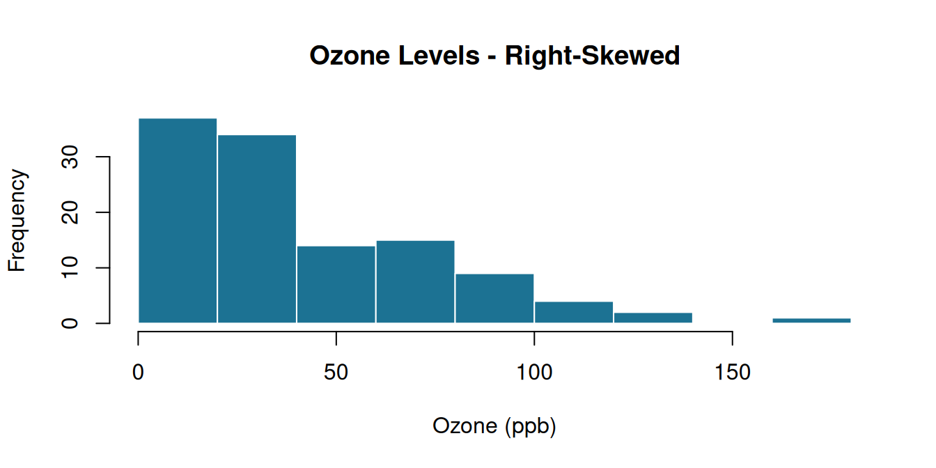
#> [1] 1.225681Compute the skewness of chickwts$weight (another built-in dataset — chick weights by feed type). Is it closer to symmetric or skewed? Confirm your answer with a histogram.
2.3 Theoretical Probability Distributions and the d/p/q/r Family
While descriptive statistics summarize our observed sample data, inferential statistics compare our sample data to theoretical probability distributions. R provides a highly unified system for working with theoretical distributions using a consistent naming convention: a prefix representing the function type, followed by the distribution’s suffix.
Prefix Functions (The d/p/q/r Family)
There are four prefixes that you can combine with any distribution name:
| Prefix | Meaning | Question it answers | R Example (Normal) |
|---|---|---|---|
d |
Density (probability mass/density) | “How tall is the curve at point \(x\)?” | dnorm(x) |
p |
Probability (cumulative distribution) | “What is the area under the curve to the left of \(x\)?” | pnorm(x) |
q |
Quantile (inverse cumulative) | “What \(x\)-value has exactly \(p\) area to its left?” | qnorm(p) |
r |
Random generation | “Give me \(n\) random draws from this distribution.” | rnorm(n) |
Distribution Suffixes
The same four prefixes apply to every standard probability distribution in R. You simply swap the suffix to target a different distribution:
| Suffix | Distribution | Required Parameters | R Example (Cumulative Probability) |
|---|---|---|---|
norm |
Normal | mean, sd (default 0, 1) |
pnorm(1.96, mean = 0, sd = 1) |
t |
Student’s t | df (degrees of freedom) |
pt(2.13, df = 15) |
chisq |
Chi-Square (\(\chi^2\)) | df |
pchisq(3.84, df = 1) |
f |
Fisher’s F | df1, df2 |
pf(4.10, df1 = 2, df2 = 20) |
binom |
Binomial | size (trials), prob |
pbinom(3, size = 10, prob = 0.5) |
Code Demonstration
Let’s test these functions in R using the standard normal distribution:
#> [1] 0.3989423#> [1] 0.9750021#> [1] 1.644854#> [1] 1.3709584 -0.5646982 0.3631284 0.6328626 0.4042683The General p-value Recipe
Understanding this d/p/q/r family is what unlocks manual statistical computing. Every hypothesis test calculates a test statistic (like \(t\), \(\chi^2\), or \(W\)). Under the null hypothesis, this statistic follows a known theoretical distribution.
The p-value is simply the probability of getting a statistic at least as extreme as the one we calculated, assuming the null hypothesis is true. In R, we compute this “area under the curve” using a p...() function. For example, if we have a chi-square statistic of \(5.4\) with \(1\) degree of freedom, our p-value is:
pchisq(5.4, df = 1, lower.tail = FALSE)
We will use this exact recipe to calculate p-values manually throughout Chapters 3, 4, and 5!
2.4 Conditional Statements
2.4.1 if / else — for single values
#> [1] "Fail"You can chain multiple conditions with else if:
grade_letter <- function(score) {
  if (score >= 90) {
    "A"
  } else if (score >= 75) {
    "B"
  } else if (score >= 50) {
    "C"
  } else {
    "F"
  }
}
grade_letter(42)
#> [1] "F"#> [1] "A"2.4.2 ifelse() — the vectorized version
if/else only works on a single value at a time. When you need to apply a condition to an entire column at once, use ifelse():
#>
#> Fail Pass
#>    1   39
Nested ifelse() for more than two categories:
scores$grade <- ifelse(scores$score >= 90, "A",
                 ifelse(scores$score >= 75, "B",
                 ifelse(scores$score >= 50, "C", "F")))
table(scores$grade)
#>
#> A B C F
#> 3 9 27 1A very common mistake: using if/else directly on a whole vector or column. if (scores$score >= 50) will only look at the first element and (in newer R versions) throw an error for the rest. Whenever you’re working on a full column, reach for ifelse(), not if.
Second example — with PlantGrowth:
data(PlantGrowth)
PlantGrowth$high_yield <- ifelse(PlantGrowth$weight > median(PlantGrowth$weight),
                                  "Above Median", "Below Median")
table(PlantGrowth$group, PlantGrowth$high_yield)
#>
#> Above Median Below Median
#> ctrl 5 5
#> trt1 2 8
#> trt2 8 2Using mtcars, create a new column efficiency that labels each car "Efficient" if mpg > 20 and "Gas Guzzler" otherwise, using ifelse().
2.5 Looping Constructs
2.5.1 for loops
Use a for loop when you know exactly how many times you want to repeat something.
#> The square of 1 is 1
#> The square of 2 is 4
#> The square of 3 is 9
#> The square of 4 is 16
#> The square of 5 is 25
A more realistic example — computing something for every column:
numeric_cols <- c("hours_studied", "score")
for (col in numeric_cols) {
  cat(col, ": mean =", round(mean(scores[[col]]), 2), "\n")
}
#> hours_studied : mean = 4.84
#> score : mean = 68.472.5.2 while loops
Use while when you don’t know in advance how many iterations you’ll need — you repeat until a condition becomes false.
total <- 0
count <- 0
while (total < 100) {
  count <- count + 1
  total <- total + count
}
cat("It took", count, "steps to pass
100. Final total:", total, "\n")
#> It took 14 steps to pass
#> 100. Final total: 105Comparison of Looping Structures
To help decide which looping structure to use in your statistical code, use this comparison matrix:
| Loop Type | Evaluation Timing | Termination Criteria | Best Use Case | R Syntax Structure |
|---|---|---|---|---|
for |
At loop entry (iterates over a sequence) | When the end of the sequence is reached | When the exact number of iterations is known beforehand (e.g., column indices) | for (i in seq) { ... } |
while |
Before entering the loop body | When the condition becomes FALSE |
When you do not know the exact count but have a condition to check first (e.g., convergence) | while (cond) { ... } |
repeat |
After executing the loop body (via break) |
Explicitly checked inside the body using a conditional break |
When the loop body must execute at least once before the condition is checked | repeat { ...; if (cond) break } |
Efficiency note: R is optimized for vectorized operations, not loops. Compare these two ways of squaring every number from 1 to 1,000,000:
#>    user  system elapsed
#> 0.057 0.001 0.058#> user system elapsed
#> 0.002 0.002 0.005The vectorized version is typically 10-50x faster. Rule of thumb: if you find yourself writing a loop to do simple arithmetic on every element of a vector, there’s almost always a vectorized alternative.
Write a for loop that goes through 1:10 and prints "even" or "odd" for each number (combine what you just learned about if/else inside a loop).
2.6 User-Defined Functions
A function packages up a piece of logic so you can reuse it without retyping it.
summary_stats <- function(x) {
  c(mean = mean(x), median = median(x), sd = sd(x), IQR = IQR(x))
}

summary_stats(scores$score)
#> mean median sd IQR
#> 68.47500 69.00000 12.70774 20.25000#> mean median sd IQR
#> 20.090625 19.200000 6.026948 7.3750002.6.1 Combining functions with sapply() and lapply()
Once you have a function, you can apply it across many columns or many groups at once, without writing a loop by hand.
#>        hours_studied    score
#> mean        4.840000 68.47500
#> median      4.650000 69.00000
#> sd          2.194842 12.70774
#> IQR         3.375000 20.25000
# Apply your function separately within each group
lapply(split(scores$score, scores$group), summary_stats)#> $A
#> mean median sd IQR
#> 67.94737 66.00000 12.42969 13.50000
#>
#> $B
#> mean median sd IQR
#> 68.95238 71.00000 13.24189 22.00000Second example — applying a custom function across an entire built-in dataset:
#>        Sepal.Length Sepal.Width Petal.Length Petal.Width
#> mean      5.8433333   3.0573333     3.758000   1.1993333
#> median    5.8000000   3.0000000     4.350000   1.3000000
#> sd        0.8280661   0.4358663     1.765298   0.7622377
#> IQR       1.3000000   0.5000000     3.500000   1.5000000
sapply() tries to simplify its result into a clean matrix or vector; lapply() always returns a list, even if every result looks similar. When you’re not sure which to use: try sapply() first, and if the output looks messy or you need to keep each result completely separate, switch to lapply().
2.6.2 A more advanced function: default arguments and multiple returns
describe_column <- function(x, digits = 2) {
  list(
    n = length(x),
    missing = sum(is.na(x)),
    mean = round(mean(x, na.rm = TRUE), digits),
    sd = round(sd(x, na.rm = TRUE), digits),
    range = round(range(x, na.rm = TRUE), digits)
  )
}

describe_column(airquality$Ozone)          # uses default digits = 2
#> $n
#> [1] 153
#>
#> $missing
#> [1] 37
#>
#> $mean
#> [1] 42.13
#>
#> $sd
#> [1] 32.99
#>
#> $range
#> [1] 1 168#> $n
#> [1] 153
#>
#> $missing
#> [1] 37
#>
#> $mean
#> [1] 42.1293
#>
#> $sd
#> [1] 32.9879
#>
#> $range
#> [1] 1 168Write a function called pass_rate(x, threshold = 50) that takes a numeric vector of scores and returns the percentage of values at or above threshold (default 50). Test it on scores$score, then test it again with threshold = 75.
2.6.3 Scoping Rules (Lexical Scoping)
An important aspect of writing user-defined functions is understanding R’s scoping rules. Scoping determines how R finds a value associated with a variable name. R uses a system called lexical scoping (or static scoping), which means that the scoping rules are determined by where the function was defined, not where it is called.
The Box-in-a-Box (Container) Analogy Think of scoping like nested boxes:
- When a function runs, it creates a small, private box (the local environment). R looks inside this small box first for any variable.
- If it cannot find the variable locally, R steps out into the next larger box (the parent environment, which is typically the global workspace) to search.
- This lookup is one-way: code in the larger box (global environment) can never look inside the small box (local environment) to access private variables!
Let’s see this in code:
x <- 10  # Defined in the global environment

scoping_demo <- function() {
  y <- 5  # Defined in the local environment
  # R finds y locally, and x globally by stepping out one level
  return(x + y)
}

scoping_demo()
#> [1] 15If we try to access the local variable y in the global environment, R throws an error because the parent box cannot look inside the child box:
2.6.4 Object-Oriented Programming (OOP) in R: The S3 System
While R is primarily a functional programming language, it also contains object-oriented programming (OOP) systems. The most common and simple OOP system in R is the S3 Class System. It is an informal system that allows you to attach a class attribute to a list, enabling generic functions (like print(), plot(), or summary()) to behave differently depending on the class of the object passed to them.
2.6.4.1
- Creating S3 Objects
An S3 object is usually a list with a
"class"attribute. You can assign the class of an object using theclass()function:
# 1. Create a basic list representing a medical patient
patient_a <- list(name = "John Doe", age = 45, heart_rate = 72)

# 2. Assign class "patient" to the list
class(patient_a) <- "patient"

# Verify the class
class(patient_a)
#> [1] "patient"2.6.4.2
- Writing S3 Methods for Existing Generics
A generic function is a function that decides which method to call based on the class of its first argument. The naming convention for S3 methods is
generic_name.class_name(). Let’s write a custom method for the standardprint()generic for our"patient"class:
# Define the print method for class "patient"
print.patient <- function(x, ...) {
  cat("=== Patient Record ===\n")
  cat("Name:      ", x$name, "\n")
  cat("Age:       ", x$age, " years\n")
  cat("Heart Rate:", x$heart_rate, " bpm\n")
}

# Now call print() on our patient object
print(patient_a)
#> === Patient Record ===
#> Name: John Doe
#> Age: 45 years
#> Heart Rate: 72 bpm2.6.4.3
- Creating Custom Generics and Methods
You can also define your own generic functions using
UseMethod(). For example, let’s create a generic namedis_unhealthyand implement a method for the"patient"class:
# Define a custom generic function
is_unhealthy <- function(x, ...) {
  UseMethod("is_unhealthy")
}

# Define the method for class "patient"
is_unhealthy.patient <- function(x, ...) {
  # Let's say heart rate > 100 or < 60 is unhealthy
  return(x$heart_rate > 100 || x$heart_rate < 60)
}

# Test our custom method
is_unhealthy(patient_a)
#> [1] FALSE2.7 Modern R Workflows: dplyr and ggplot2 Basics
Up to now, we have written code in Base R (the core R language). However, in modern data science, most R users use packages from the Tidyverse—a collection of R packages designed for data science. The two most important packages in the Tidyverse are:
dplyr: For fast, intuitive data manipulation.ggplot2: For building elegant and complex graphics using the “Grammar of Graphics.”
2.7.1 The Pipe Operator (%>% or |>)
Before learning the functions, we must understand the pipe operator (%>% from the magrittr package, or R’s built-in native pipe |>). Think of the pipe as reading “and then”. It takes the output of one function and passes it as the first parameter to the next function.
The Baking Analogy: Imagine you are baking a cake.
Nested (Base R) Style: To write this in nested functions, it looks like this:
frost(bake(add_sugar(flour)))You have to read this from the inside-out (start with flour, then sugar, then bake, then frost).Piped (Tidyverse) Style: Chaining it with pipes looks like this:
flour %>% add_sugar() %>% bake() %>% frost()This reads naturally from left-to-right (take flour, and then add sugar, and then bake, and then frost).
Let’s compare in code:
2.7.2 Step-by-Step Data Manipulation with dplyr
dplyr uses clean, verbs-based functions to manipulate data frames. Let’s learn them one-by-one, progressing from minor examples to advanced applications.
2.7.2.1
- Column Selection with
select()select()allows you to subset columns from a data frame.
- Minor (Select One Column):
- Medium (Select Multiple Columns):
- Advanced (Deselect/Exclude Columns):
Use the minus sign
-to keep everything except specific columns.
2.7.2.2
- Row Filtering with
filter()filter()allows you to subset rows based on logical conditions.
- Minor (Single Numeric Condition):
- Medium (Character/Categorical Match):
- Advanced (Multiple Combined Conditions):
Combine conditions using
&(AND) or|(OR).
  # Filter students in Group A AND studied more than 6 hours
  scores %>%
    filter(group == "A" & hours_studied > 6)
2.7.2.3
- Creating/Modifying Columns with
mutate()mutate()allows you to compute and add new columns, or overwrite existing ones.
- Minor (Add Constant Column):
- Medium (Arithmetic Transformation): Calculate score percentage out of a maximum of 100:
- Advanced (Conditional Columns using
ifelse): Create a pass/fail indicator column based on scores:
2.7.2.4
- Grouping & Summarizing with
group_by()andsummarise()group_by()groups your dataset by a categorical variable, andsummarise()calculates summary statistics for each group. They are almost always used together.
- Minor (Overall Summary - No Grouping):
- Medium (Grouped Summary): Calculate the average score separately for each group:
- Advanced (Multiple Grouped Metrics):
Calculate the mean, standard deviation, and count
n()for multiple groups:
  scores %>%
    group_by(group) %>%
    summarise(
      avg_score = mean(score),
      sd_score = sd(score),
      sample_size = n()
    )
2.7.3 Chaining It All Together (A Complete Pipeline)
Now, let’s combine all these functions into a single pipeline. We want to take our raw scores data, filter out students who didn’t study, create a pass/fail variable, group by their study group, and calculate the pass rate and average score.
- Base R Nested Way (Very hard to read and debug):
  sub_df <- scores[scores$hours_studied > 2, ]
  sub_df$status <- ifelse(sub_df$score >= 50, 1, 0)
aggregate(cbind(score, status) ~ group, data = sub_df, FUN = mean)- Modern
dplyrChained Pipeline:
  scores %>%
    filter(hours_studied > 2) %>%
    mutate(passed = ifelse(score >= 50, 1, 0)) %>%
    group_by(group) %>%
    summarise(
      average_score = mean(score),
      pass_rate = mean(passed) * 100,
      total_students = n()
    )
Notice how the dplyr pipeline reads like a step-by-step description of your analysis plan, making it simple to write, read, and maintain.
2.7.4 Grammar of Graphics with ggplot2
ggplot2 is built on the Grammar of Graphics philosophy: a plot is constructed by layering components (Data \(\rightarrow\) Aesthetics \(\rightarrow\) Geometries \(\rightarrow\) Labels \(\rightarrow\) Themes) on top of each other using the + operator.
Let’s build a histogram step-by-step, showing how a plot grows from a blank canvas to a publication-ready figure.
2.7.4.1 Step 1: The Blank Canvas
Initialize the plot with the dataset and the aesthetic mappings aes() (telling R that the x-axis maps to Ozone levels).
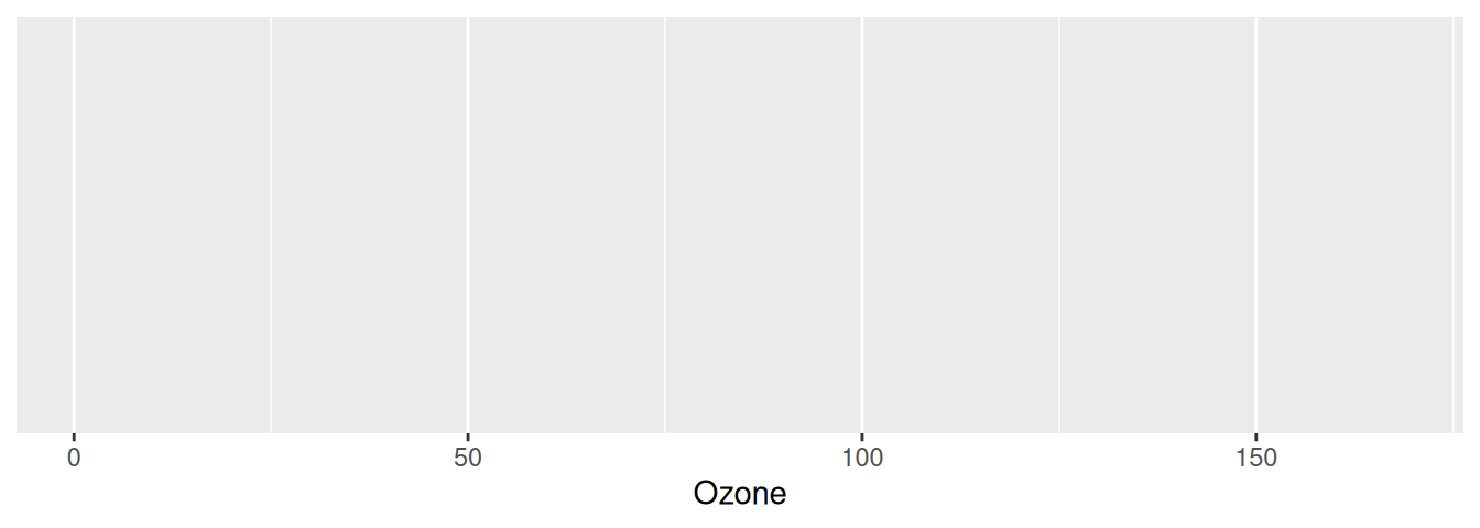 Note: This creates a blank grey grid because we haven’t told R what shape (geometry) to draw on the canvas yet.
2.7.4.2 Step 2: Adding a Geometry (geom_*)
We add a geometry layer using the + operator. For a single numeric variable, we use geom_histogram().
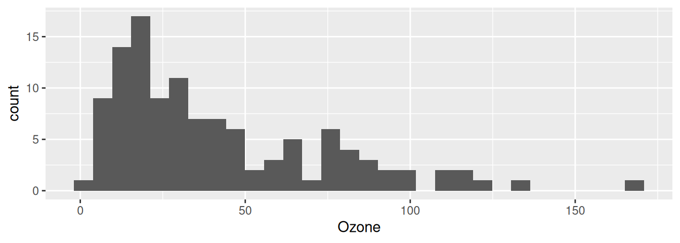
2.7.4.3 Step 3: Customizing the Geometry
We can customize the shape outlines, fill colors, and the number of bins inside geom_histogram().
ggplot(airquality, aes(x = Ozone)) +
  geom_histogram(fill = "#1C7293", color = "white", bins = 10, na.rm = TRUE)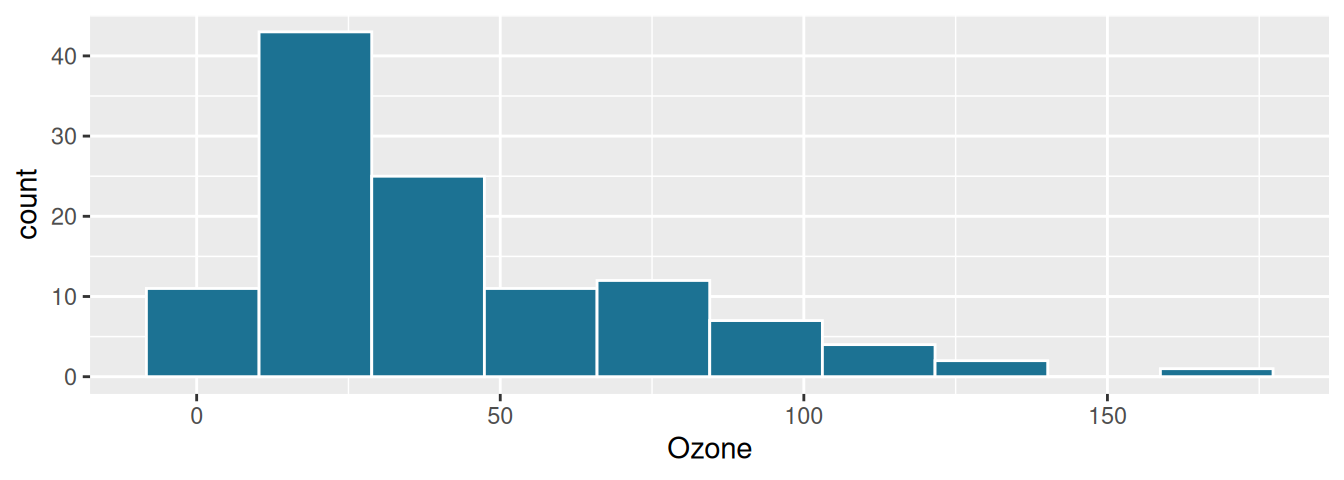
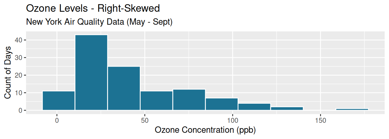
2.7.4.4 Step 4: Adding Titles & Axis Labels (labs())
Add clear, professional titles and coordinate labels:
ggplot(airquality, aes(x = Ozone)) +
  geom_histogram(fill = "#1C7293", color = "white", bins = 10, na.rm = TRUE) +
  labs(
    title = "Ozone Levels - Right-Skewed",
    subtitle = "New York Air Quality Data (May - Sept)",
    x = "Ozone Concentration (ppb)",
    y = "Count of Days"
  )
2.7.4.5 Step 5: Applying a Theme (theme_*())
Themes clean up the background grid and borders. theme_minimal() is a clean, modern option:
ggplot(airquality, aes(x = Ozone)) +
  geom_histogram(fill = "#1C7293", color = "white", bins = 10, na.rm = TRUE) +
  labs(
    title = "Ozone Levels - Right-Skewed",
    subtitle = "New York Air Quality Data (May - Sept)",
    x = "Ozone Concentration (ppb)",
    y = "Count of Days"
  ) +
  theme_minimal()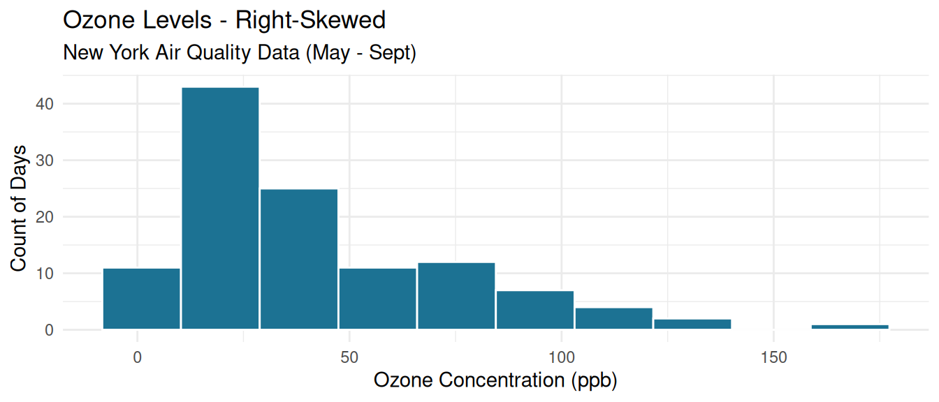
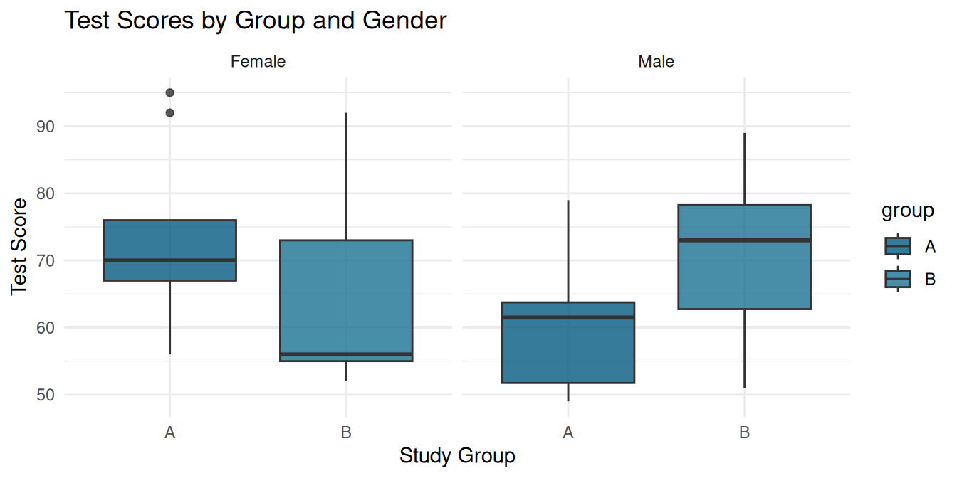
2.7.5 Visualizing Groups (Advanced ggplot2)
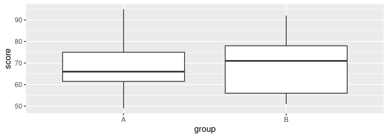
ggplot2 shines when comparing different groups of data. Let’s build a boxplot step-by-step to compare test scores between groups.
- Step A: Basic Boxplot:
We map the x-axis to
group(categorical) and the y-axis toscore(numeric) usinggeom_boxplot():
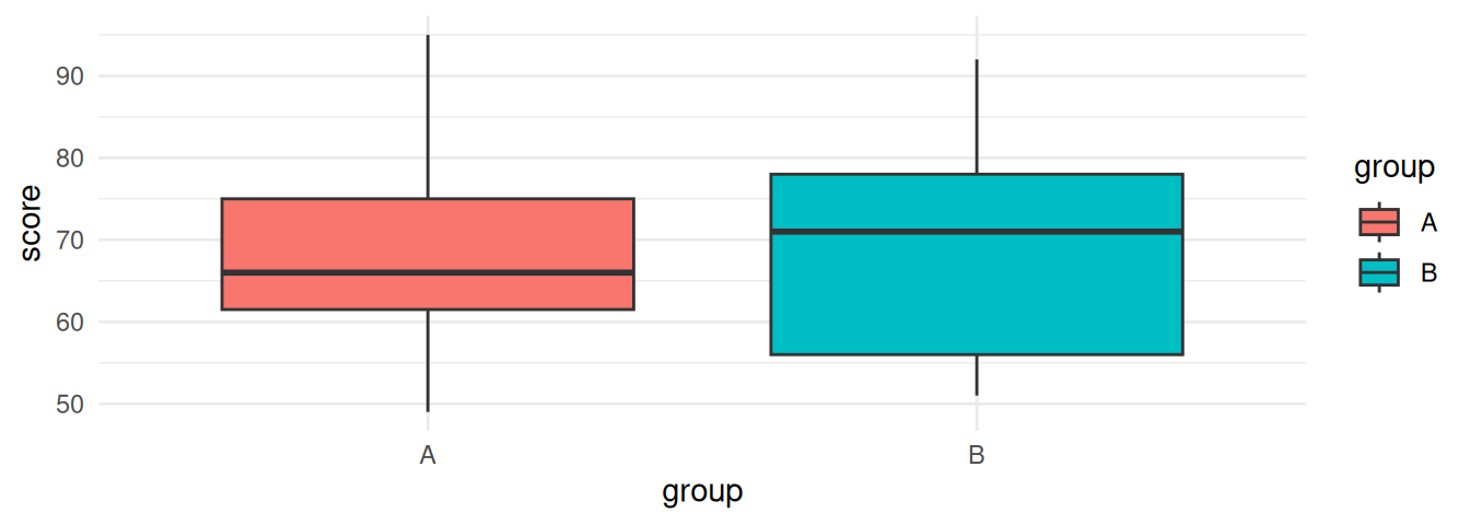
- Step B: Add Group Coloring (
fill): To color the boxes by group, we addfill = groupinside the aesthetic mappingsaes():
- Step C: Custom Colors & Facet Wrap (Subplots):
Let’s manually define the colors using
scale_fill_manual()and draw separate subplots for each gender usingfacet_wrap():
  # Simulate a sex variable for illustration:
  set.seed(42)
  scores_sex <- scores %>%
    mutate(sex = sample(c("Male", "Female"), n(), replace = TRUE))

  ggplot(scores_sex, aes(x = group, y = score, fill = group)) +
    geom_boxplot(alpha = 0.8) +
    scale_fill_manual(values = c("A" = "#065A82", "B" = "#1C7293")) +
    facet_wrap(~sex) +
    theme_minimal() +
    labs(
      title = "Test Scores by Group and Gender",
      x = "Study Group",
      y = "Test Score"
    )
2.7.6 Visual Plot Builder: The esquisse Package
If you find ggplot2 syntax intimidating at first, R offers an interactive helper package called esquisse. It provides a drag-and-drop Shiny GUI directly inside RStudio to build plots visually and automatically outputs the exact ggplot2 code for you to copy.
To try it out, run this code in your interactive RStudio Console (not inside an Rmd code chunk):
# 1. Install the package
install.packages("esquisse")

# 2. Launch the visual builder with a dataset
esquisse::esquisser(airquality)
In the window that pops up:
- Drag the
Ozonevariable box into the X axis slot. - The builder will automatically render a Histogram.
- Go to the Labels & Title tab at the bottom to type your custom labels.
- Click on the Code button in the bottom right corner, copy the generated code, and paste it into your script. It is a fantastic way to learn ggplot2!
Exercise: dplyr and ggplot2
Using R’s built-in mtcars dataset:
- Write a
dplyrpipeline that:- Filters for cars with horsepower (
hp) greater than 100. - Selects the columns
mpg(miles per gallon),cyl(cylinders), andhp. - Groups the data by
cyl. - Summarises the average
mpgand averagehpfor each cylinder group.
- Filters for cars with horsepower (
- Use
ggplot2to draw a boxplot ofmpg(y-axis) by cylinder group (x-axis). (Hint: convertcylto a factor inside the aesthetics mapping:aes(x = as.factor(cyl), y = mpg)so that R treats cylinders as a categorical group rather than a continuous number).
- The mean is sensitive to outliers; the median is not — always compute both.
- Skewness and kurtosis give you a numeric handle on distribution shape, foreshadowing why Chapters 3 and 5 exist.
- Use
if/elsefor single values,ifelse()for whole vectors/columns — mixing these up is one of the most common beginner bugs. for,while, andrepeateach suit a different situation, but vectorized operations usually beat all three for simple arithmetic.- Writing your own functions, then applying them with
sapply()/lapply(), is how you scale a one-off calculation into a repeatable, reliable workflow. dplyrandggplot2form the backbone of modern R workflows, allowing you to manipulate datasets using clean verbs and build professional, publication-grade plots layer-by-layer.
Next, in Chapter 3, we’ll use these programming skills to build a bootstrap resampling procedure from scratch — the foundation of every modern non-parametric confidence interval.
Chapter 2 covered:
- Central tendency: Mean (sensitive to outliers), median (robust), mode (for categorical), trimmed mean (balanced)
- Dispersion: Variance \(s^2 = \frac{1}{n-1}\sum(x_i-\bar{x})^2\), standard deviation \(s\), IQR \(= Q_3 - Q_1\), coefficient of variation \(CV = s/\bar{x}\)
- Visualisation: Histograms (distribution shape), boxplots (outliers and quartiles), density plots (smooth shape estimate)
- Programming: Functions with
function(),for/whileloops,apply()/sapply()/lapply()for column-wise operations - Summary tables:
psych::describe()for a comprehensive numeric summary;gtsummary::tbl_summary()for publication-ready tables
Coming up: Chapter 3 moves from describing samples to inferring population parameters — specifically, constructing confidence intervals using both parametric theory and the bootstrap.
2.8 Lab 2: Full Descriptive Profile of the Course Dataset
Objective: Conduct a complete descriptive analysis of the course_dataset, mirroring what you would do at the start of a real research project.
Dataset: course_dataset.csv (provided in the data/ folder).
2.8.1 Step 1: Load and Inspect
#> 'data.frame':    180 obs. of  14 variables:
#>  $ id             : chr  "P001" "P002" "P003" "P004" ...
#>  $ site           : chr  "Site C" "Site B" "Site A" "Site C" ...
#>  $ treatment      : chr  "New" "Standard" "New" "Standard" ...
#>  $ age            : int  59 68 33 53 58 49 42 40 67 49 ...
#>  $ sex            : chr  "Male" "Male" "Male" "Male" ...
#>  $ activity_level : chr  "Moderate" "High" "Moderate" "Low" ...
#>  $ baseline_pain  : num  8.7 6.7 7.6 5.5 6 4.1 6.8 6 5.8 6.6 ...
#>  $ week4_pain     : num  5.8 6.5 3.9 2.7 5.9 4.6 6.6 2.5 4.4 2.9 ...
#>  $ week8_pain     : num  5.1 5.6 0.1 2.4 5.1 4.6 4.2 2.4 3.5 1.3 ...
#>  $ response       : chr  "Responder" "Non-Responder" "Responder" "Responder" ...
#>  $ symptom_pre    : chr  "Present" "Absent" "Present" "Present" ...
#>  $ symptom_post   : chr  "Absent" "Present" "Present" "Absent" ...
#>  $ rater1_severity: chr  "Severe" "Mild" "Moderate" "Severe" ...
#> $ rater2_severity: chr "Severe" "Mild" "Moderate" "Severe" ...#> [1] 180 142.8.3 Step 3: Visualise Key Variables
par(mfrow = c(1, 2))
hist(course_df$baseline_pain, main = "Baseline Pain", xlab = "Pain Score",
     col = "#AED6F1", border = "white", breaks = 15)
boxplot(course_df$baseline_pain, main = "Baseline Pain (Boxplot)",
        col = "#AED6F1", border = "#1A5276")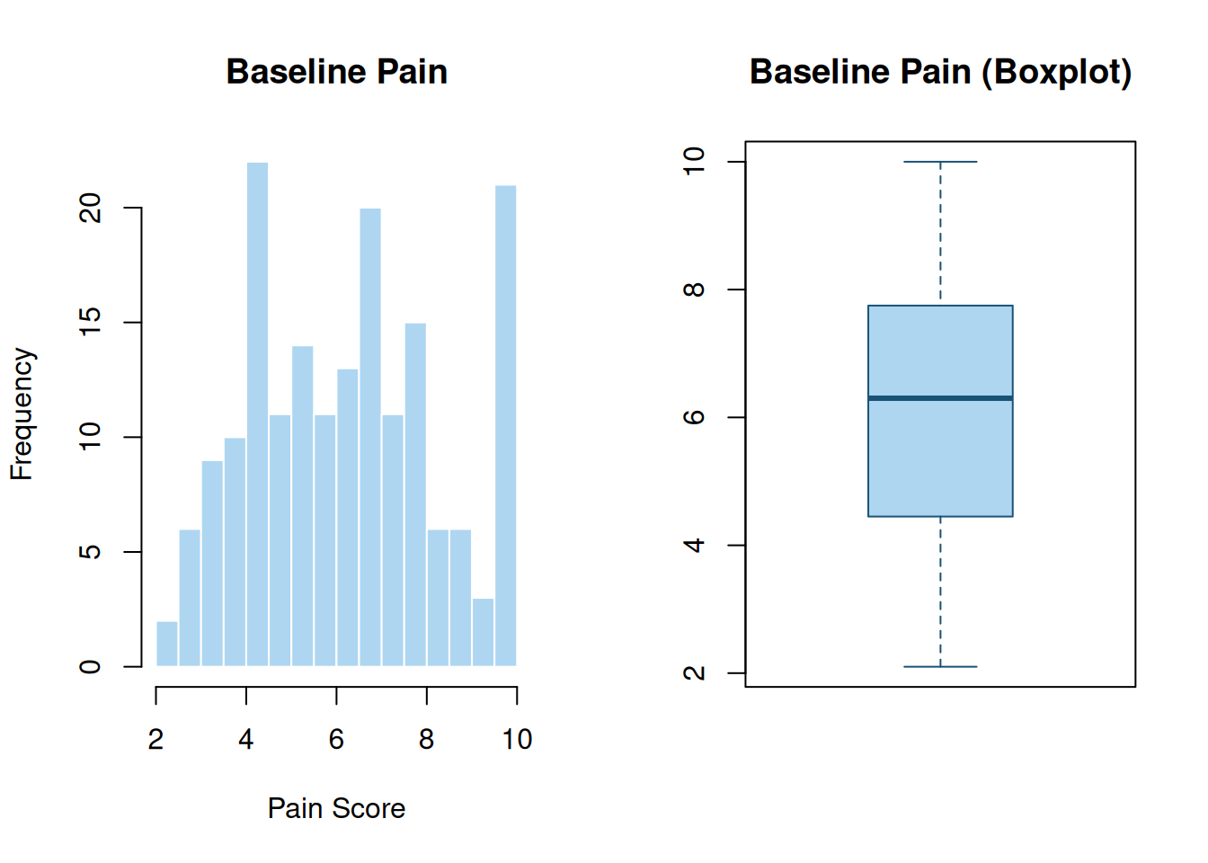
2.8.4 Step 4: Group Comparison
# Mean baseline pain by treatment group
tapply(course_df$baseline_pain, course_df$treatment, mean, na.rm = TRUE)
#> New Standard
#> 6.189583 6.371429# Side-by-side boxplots
boxplot(baseline_pain ~ treatment, data = course_df,
col = c("#AED6F1", "#A9DFBF"),
main = "Baseline Pain by Treatment Group",
xlab = "Treatment", ylab = "Pain Score")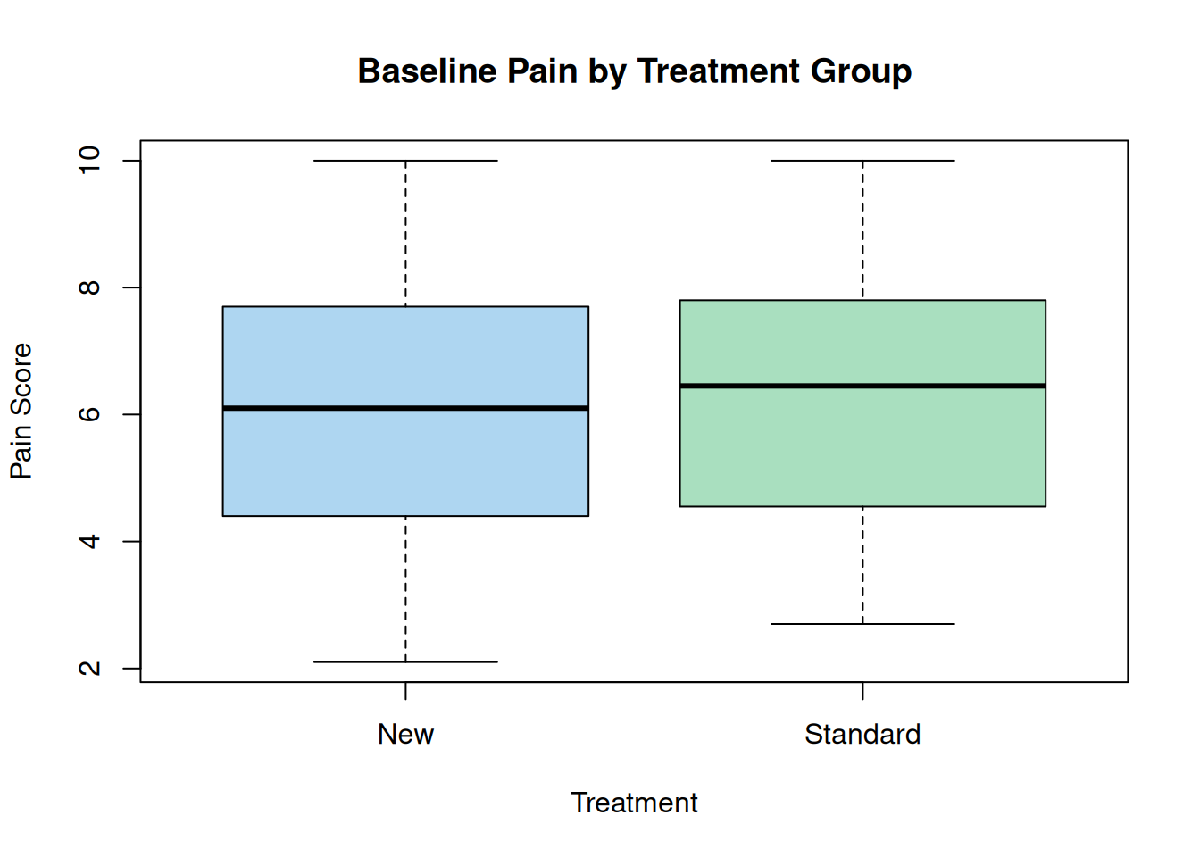
2.8.5 Step 5: Publication Summary Table
library(gtsummary)
tbl_summary(course_df,
            by = treatment,
            statistic = list(all_continuous() ~ "{mean} ({sd})"),
            missing = "no") |>
  add_p() |>
bold_labels()| Characteristic | New N = 961 |
Standard N = 841 |
p-value |
|---|---|---|---|
| id | |||
| P001 | 1 (1.0%) | 0 (0%) | |
| P002 | 0 (0%) | 1 (1.2%) | |
| P003 | 1 (1.0%) | 0 (0%) | |
| P004 | 0 (0%) | 1 (1.2%) | |
| P005 | 0 (0%) | 1 (1.2%) | |
| P006 | 0 (0%) | 1 (1.2%) | |
| P007 | 1 (1.0%) | 0 (0%) | |
| P008 | 1 (1.0%) | 0 (0%) | |
| P009 | 1 (1.0%) | 0 (0%) | |
| P010 | 1 (1.0%) | 0 (0%) | |
| P011 | 1 (1.0%) | 0 (0%) | |
| P012 | 1 (1.0%) | 0 (0%) | |
| P013 | 0 (0%) | 1 (1.2%) | |
| P014 | 0 (0%) | 1 (1.2%) | |
| P015 | 0 (0%) | 1 (1.2%) | |
| P016 | 1 (1.0%) | 0 (0%) | |
| P017 | 1 (1.0%) | 0 (0%) | |
| P018 | 0 (0%) | 1 (1.2%) | |
| P019 | 0 (0%) | 1 (1.2%) | |
| P020 | 0 (0%) | 1 (1.2%) | |
| P021 | 0 (0%) | 1 (1.2%) | |
| P022 | 0 (0%) | 1 (1.2%) | |
| P023 | 0 (0%) | 1 (1.2%) | |
| P024 | 1 (1.0%) | 0 (0%) | |
| P025 | 1 (1.0%) | 0 (0%) | |
| P026 | 1 (1.0%) | 0 (0%) | |
| P027 | 0 (0%) | 1 (1.2%) | |
| P028 | 0 (0%) | 1 (1.2%) | |
| P029 | 1 (1.0%) | 0 (0%) | |
| P030 | 1 (1.0%) | 0 (0%) | |
| P031 | 0 (0%) | 1 (1.2%) | |
| P032 | 0 (0%) | 1 (1.2%) | |
| P033 | 1 (1.0%) | 0 (0%) | |
| P034 | 1 (1.0%) | 0 (0%) | |
| P035 | 1 (1.0%) | 0 (0%) | |
| P036 | 0 (0%) | 1 (1.2%) | |
| P037 | 0 (0%) | 1 (1.2%) | |
| P038 | 1 (1.0%) | 0 (0%) | |
| P039 | 0 (0%) | 1 (1.2%) | |
| P040 | 0 (0%) | 1 (1.2%) | |
| P041 | 0 (0%) | 1 (1.2%) | |
| P042 | 0 (0%) | 1 (1.2%) | |
| P043 | 1 (1.0%) | 0 (0%) | |
| P044 | 1 (1.0%) | 0 (0%) | |
| P045 | 1 (1.0%) | 0 (0%) | |
| P046 | 1 (1.0%) | 0 (0%) | |
| P047 | 1 (1.0%) | 0 (0%) | |
| P048 | 0 (0%) | 1 (1.2%) | |
| P049 | 0 (0%) | 1 (1.2%) | |
| P050 | 1 (1.0%) | 0 (0%) | |
| P051 | 1 (1.0%) | 0 (0%) | |
| P052 | 0 (0%) | 1 (1.2%) | |
| P053 | 1 (1.0%) | 0 (0%) | |
| P054 | 0 (0%) | 1 (1.2%) | |
| P055 | 0 (0%) | 1 (1.2%) | |
| P056 | 1 (1.0%) | 0 (0%) | |
| P057 | 1 (1.0%) | 0 (0%) | |
| P058 | 1 (1.0%) | 0 (0%) | |
| P059 | 1 (1.0%) | 0 (0%) | |
| P060 | 0 (0%) | 1 (1.2%) | |
| P061 | 0 (0%) | 1 (1.2%) | |
| P062 | 0 (0%) | 1 (1.2%) | |
| P063 | 0 (0%) | 1 (1.2%) | |
| P064 | 1 (1.0%) | 0 (0%) | |
| P065 | 0 (0%) | 1 (1.2%) | |
| P066 | 0 (0%) | 1 (1.2%) | |
| P067 | 1 (1.0%) | 0 (0%) | |
| P068 | 1 (1.0%) | 0 (0%) | |
| P069 | 1 (1.0%) | 0 (0%) | |
| P070 | 0 (0%) | 1 (1.2%) | |
| P071 | 1 (1.0%) | 0 (0%) | |
| P072 | 1 (1.0%) | 0 (0%) | |
| P073 | 1 (1.0%) | 0 (0%) | |
| P074 | 1 (1.0%) | 0 (0%) | |
| P075 | 0 (0%) | 1 (1.2%) | |
| P076 | 0 (0%) | 1 (1.2%) | |
| P077 | 0 (0%) | 1 (1.2%) | |
| P078 | 1 (1.0%) | 0 (0%) | |
| P079 | 0 (0%) | 1 (1.2%) | |
| P080 | 0 (0%) | 1 (1.2%) | |
| P081 | 1 (1.0%) | 0 (0%) | |
| P082 | 0 (0%) | 1 (1.2%) | |
| P083 | 0 (0%) | 1 (1.2%) | |
| P084 | 1 (1.0%) | 0 (0%) | |
| P085 | 1 (1.0%) | 0 (0%) | |
| P086 | 0 (0%) | 1 (1.2%) | |
| P087 | 0 (0%) | 1 (1.2%) | |
| P088 | 0 (0%) | 1 (1.2%) | |
| P089 | 1 (1.0%) | 0 (0%) | |
| P090 | 0 (0%) | 1 (1.2%) | |
| P091 | 0 (0%) | 1 (1.2%) | |
| P092 | 1 (1.0%) | 0 (0%) | |
| P093 | 1 (1.0%) | 0 (0%) | |
| P094 | 1 (1.0%) | 0 (0%) | |
| P095 | 1 (1.0%) | 0 (0%) | |
| P096 | 0 (0%) | 1 (1.2%) | |
| P097 | 1 (1.0%) | 0 (0%) | |
| P098 | 0 (0%) | 1 (1.2%) | |
| P099 | 0 (0%) | 1 (1.2%) | |
| P100 | 0 (0%) | 1 (1.2%) | |
| P101 | 1 (1.0%) | 0 (0%) | |
| P102 | 0 (0%) | 1 (1.2%) | |
| P103 | 1 (1.0%) | 0 (0%) | |
| P104 | 1 (1.0%) | 0 (0%) | |
| P105 | 0 (0%) | 1 (1.2%) | |
| P106 | 0 (0%) | 1 (1.2%) | |
| P107 | 0 (0%) | 1 (1.2%) | |
| P108 | 0 (0%) | 1 (1.2%) | |
| P109 | 0 (0%) | 1 (1.2%) | |
| P110 | 1 (1.0%) | 0 (0%) | |
| P111 | 1 (1.0%) | 0 (0%) | |
| P112 | 1 (1.0%) | 0 (0%) | |
| P113 | 1 (1.0%) | 0 (0%) | |
| P114 | 1 (1.0%) | 0 (0%) | |
| P115 | 0 (0%) | 1 (1.2%) | |
| P116 | 1 (1.0%) | 0 (0%) | |
| P117 | 1 (1.0%) | 0 (0%) | |
| P118 | 1 (1.0%) | 0 (0%) | |
| P119 | 1 (1.0%) | 0 (0%) | |
| P120 | 0 (0%) | 1 (1.2%) | |
| P121 | 0 (0%) | 1 (1.2%) | |
| P122 | 1 (1.0%) | 0 (0%) | |
| P123 | 0 (0%) | 1 (1.2%) | |
| P124 | 1 (1.0%) | 0 (0%) | |
| P125 | 0 (0%) | 1 (1.2%) | |
| P126 | 1 (1.0%) | 0 (0%) | |
| P127 | 1 (1.0%) | 0 (0%) | |
| P128 | 1 (1.0%) | 0 (0%) | |
| P129 | 0 (0%) | 1 (1.2%) | |
| P130 | 1 (1.0%) | 0 (0%) | |
| P131 | 1 (1.0%) | 0 (0%) | |
| P132 | 1 (1.0%) | 0 (0%) | |
| P133 | 1 (1.0%) | 0 (0%) | |
| P134 | 1 (1.0%) | 0 (0%) | |
| P135 | 0 (0%) | 1 (1.2%) | |
| P136 | 1 (1.0%) | 0 (0%) | |
| P137 | 0 (0%) | 1 (1.2%) | |
| P138 | 1 (1.0%) | 0 (0%) | |
| P139 | 1 (1.0%) | 0 (0%) | |
| P140 | 0 (0%) | 1 (1.2%) | |
| P141 | 1 (1.0%) | 0 (0%) | |
| P142 | 0 (0%) | 1 (1.2%) | |
| P143 | 1 (1.0%) | 0 (0%) | |
| P144 | 1 (1.0%) | 0 (0%) | |
| P145 | 1 (1.0%) | 0 (0%) | |
| P146 | 1 (1.0%) | 0 (0%) | |
| P147 | 0 (0%) | 1 (1.2%) | |
| P148 | 0 (0%) | 1 (1.2%) | |
| P149 | 1 (1.0%) | 0 (0%) | |
| P150 | 1 (1.0%) | 0 (0%) | |
| P151 | 1 (1.0%) | 0 (0%) | |
| P152 | 0 (0%) | 1 (1.2%) | |
| P153 | 1 (1.0%) | 0 (0%) | |
| P154 | 0 (0%) | 1 (1.2%) | |
| P155 | 1 (1.0%) | 0 (0%) | |
| P156 | 1 (1.0%) | 0 (0%) | |
| P157 | 0 (0%) | 1 (1.2%) | |
| P158 | 0 (0%) | 1 (1.2%) | |
| P159 | 1 (1.0%) | 0 (0%) | |
| P160 | 0 (0%) | 1 (1.2%) | |
| P161 | 1 (1.0%) | 0 (0%) | |
| P162 | 0 (0%) | 1 (1.2%) | |
| P163 | 0 (0%) | 1 (1.2%) | |
| P164 | 1 (1.0%) | 0 (0%) | |
| P165 | 1 (1.0%) | 0 (0%) | |
| P166 | 0 (0%) | 1 (1.2%) | |
| P167 | 1 (1.0%) | 0 (0%) | |
| P168 | 0 (0%) | 1 (1.2%) | |
| P169 | 1 (1.0%) | 0 (0%) | |
| P170 | 0 (0%) | 1 (1.2%) | |
| P171 | 0 (0%) | 1 (1.2%) | |
| P172 | 1 (1.0%) | 0 (0%) | |
| P173 | 1 (1.0%) | 0 (0%) | |
| P174 | 1 (1.0%) | 0 (0%) | |
| P175 | 1 (1.0%) | 0 (0%) | |
| P176 | 0 (0%) | 1 (1.2%) | |
| P177 | 0 (0%) | 1 (1.2%) | |
| P178 | 0 (0%) | 1 (1.2%) | |
| P179 | 1 (1.0%) | 0 (0%) | |
| P180 | 0 (0%) | 1 (1.2%) | |
| site | |||
| Site A | 27 (28%) | 36 (43%) | |
| Site B | 42 (44%) | 32 (38%) | |
| Site C | 27 (28%) | 16 (19%) | |
| age | 54 (13) | 51 (12) | |
| sex | |||
| Female | 50 (52%) | 45 (54%) | |
| Male | 46 (48%) | 39 (46%) | |
| activity_level | |||
| High | 24 (25%) | 13 (15%) | |
| Low | 39 (41%) | 28 (33%) | |
| Moderate | 33 (34%) | 43 (51%) | |
| baseline_pain | 6.19 (2.09) | 6.37 (2.13) | |
| week4_pain | 3.67 (2.19) | 5.12 (2.49) | |
| week8_pain | 2.45 (1.92) | 4.48 (2.58) | |
| response | |||
| Non-Responder | 4 (4.2%) | 45 (54%) | |
| Responder | 92 (96%) | 39 (46%) | |
| symptom_pre | |||
| Absent | 21 (22%) | 23 (27%) | |
| Present | 75 (78%) | 61 (73%) | |
| symptom_post | |||
| Absent | 64 (67%) | 39 (46%) | |
| Present | 32 (33%) | 45 (54%) | |
| rater1_severity | |||
| Mild | 31 (32%) | 34 (40%) | |
| Moderate | 45 (47%) | 31 (37%) | |
| Severe | 20 (21%) | 19 (23%) | |
| rater2_severity | |||
| Mild | 35 (36%) | 29 (35%) | |
| Moderate | 41 (43%) | 35 (42%) | |
| Severe | 20 (21%) | 20 (24%) | |
| 1 n (%); Mean (SD) | |||
2.8.6 Lab Exercises
- Compute the CV (coefficient of variation) for
baseline_painandweek8_pain. Which variable has greater relative variability? - Write a custom R function
my_summary(x)that returns a named vector with min, Q1, median, mean, Q3, max, and number of NAs. - Apply
my_summary()to every numeric column ofcourse_dfusingsapply().